How to Structure a Music Landing Page That Actually Converts
A music landing page has one job: get a visitor who clicked a link from somewhere else to take a specific action before they leave. That sounds simple until an artist starts adding sections, streaming links, tour dates, merch, a mailing list signup, a music video, and the page turns into a scroll with no clear priority. The components matter, but the order and structure matter just as much.
Start with one action, not five
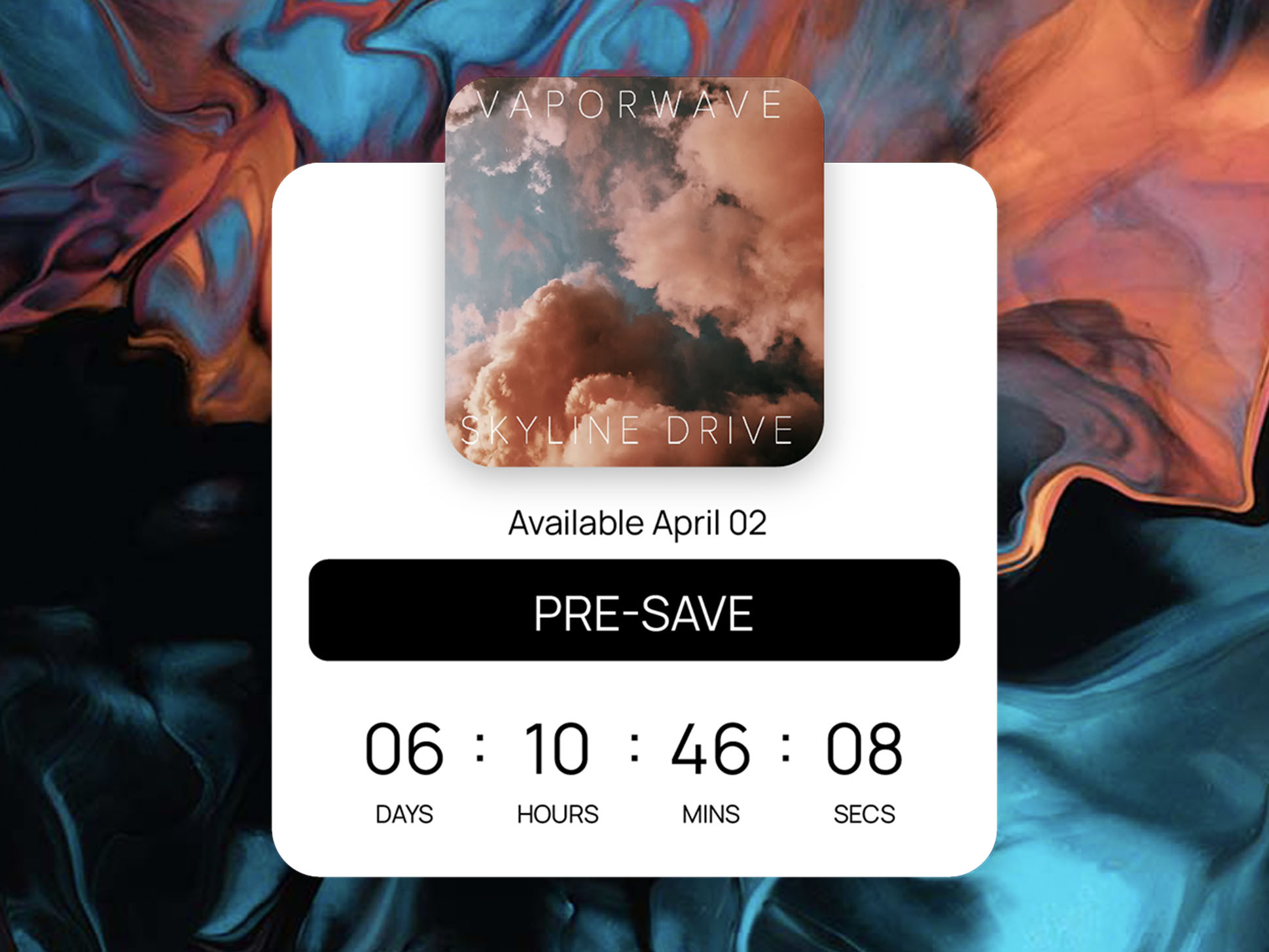
Every landing page should have a single primary action it's built around: pre-save this release, buy this ticket, join this list. Everything else on the page is secondary. A page trying to be equally good at five things usually converts on none of them, because a first-time visitor doesn't know what they're supposed to do first.
Put the primary action above the fold
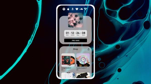
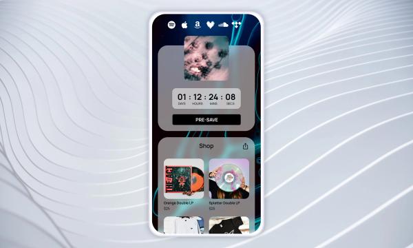
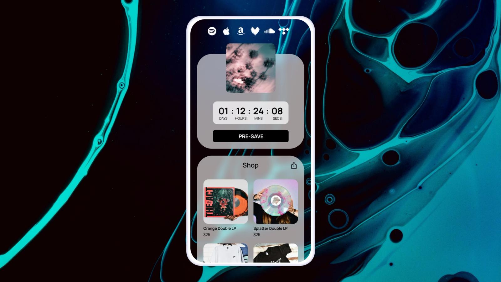
A visitor arriving from a social bio link or an ad shouldn't have to scroll to find out what the page wants them to do. The streaming action or ticket link tied to the page's primary goal belongs at the top, visible without any interaction, not buried under an artist bio or a full tracklist.
Order secondary components by relevance to the primary action
If the page's main goal is a pre-save, merch and tour dates still belong on the page, they just belong below the fold, ordered by how closely related they are to the release. A tour supporting the new album is more relevant than a general store link, so it should sit closer to the top of the secondary section.
Use one page per goal instead of one page for everything
A single link-in-bio page trying to cover every release, tour, and store an artist has ever put out asks a visitor to do the sorting work themselves. A release-specific landing page, with its own URL and its own single focus, converts better precisely because it doesn't ask the visitor to figure out what's relevant to them.
Keep the mobile experience the actual test
Most landing page traffic arrives from a phone, usually from a social bio link or a text message. A page that looks organized on a desktop monitor can turn into an unreadable wall of buttons on a five-inch screen. Building and testing on mobile first, rather than adapting a desktop layout afterward, catches that problem before it costs conversions.
Custom domains and consistent branding build trust
A landing page on a generic shared domain reads differently to a fan than one on an artist's own custom domain. It's a small detail, but it's part of why the page structure conversation includes domain and branding choices, not just component order. A page that looks and feels like it belongs to the artist converts better than one that looks like a template with a photo swapped in.
Structure is a strategy decision, not a design afterthought
It's tempting to treat landing page layout as the last step before publishing, something to tidy up after the actual campaign planning is done. Treating structure as part of the campaign strategy itself, built around one clear action and ordered by relevance, is usually the difference between a page that converts and one that just exists.